How well does this technology work? Is it easy to use?
The technology is user-friendly for both teachers and students. The site is consistently updated based on feedback. For example, the option to customize the scenarios was added after teachers suggested the idea. The graphs created by students are precise based upon what the student draws. It is a bit easier to complete this task on a tablet; the use of a stylus or hands can be easier to manipulate than a track pad or mouse.
Are the written materials well organized and useful?
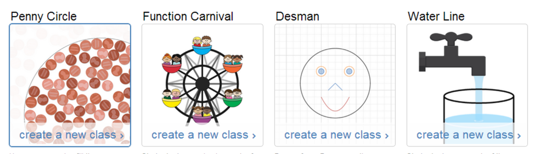
Yes! The lesson outline and ability to walk-through the activity with teacher tips gives a clear direction for implementation of the technology. The rationale behind Function Carnival also helps teachers see the usefulness of the activity.
The prompts within the task are easy to understand for students. Error analysis questions provide students an opportunity to apply what they investigated during the graphing activities.
The prompts within the task are easy to understand for students. Error analysis questions provide students an opportunity to apply what they investigated during the graphing activities.
What is the goal of the technology? Is the goal reached?
The goal of the technology is for students to sketch graphs of scenarios that show an understanding of how a variable changes over time. The technology reaches this goal through multiple explorations which do not allow students to move on without a certain level of accuracy. The variety of activities ensures that students can understand the relationship between x and y in unfamiliar situations. Error analysis questions demonstrate an ability to verbalize understanding and clear up common misconceptions. The flexibility of using different scenarios allows teachers to assign scenarios that are more specific to the goals of the class.
Does the technology enhance the teaching or learning process?
|
Watch this video of a student explaining how he adjusted his graph as he worked.
The student is making connections between speed and slope. He also uses the provided graphic of the cannon man to adjust his thinking, creating a more precise graph. |
|
Would you recommend this product to schools?
Yes! The interactive tools are engaging for students initially and challenging enough to hold their interest. The Desmos team understands the importance of mathematical accuracy and the value of student exploration. The activity is free, which is awesome! They have created other free tasks that I also recommend teachers explore. The Water Line task was released in the spring of 2014, which hopefully means additional tasks are in the works! All of these are available on the Teacher Dashboard.